04 · Allianz Commercial · Underwriting
Four tools, one quote: unifying underwriting into a single workbench.
Underwriters were switching between four regional systems and re-keying data by hand before they could price a risk. I helped redesign that patchwork into one workbench where the whole submission lives in a single place.
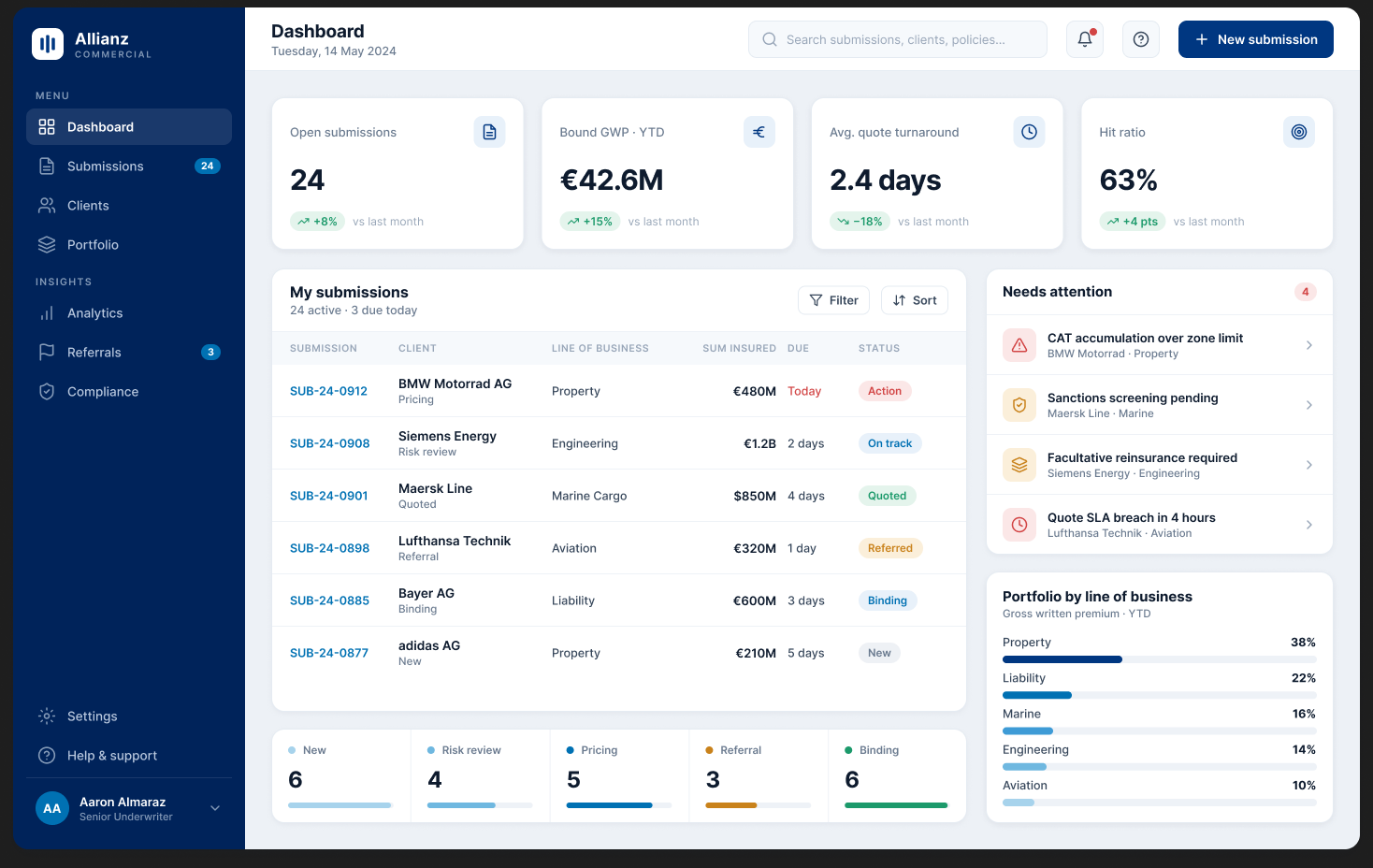
Screens shown are a portfolio-safe reconstruction of the shipped design, rebuilt from scratch for this case study. Confidential client UI is not reproduced. Sample data throughout.
At a glance
The one-minute version
An underwriting workbench is the underwriter's command centre for assessing and pricing risk. When Allianz brought its mid and large corporate business together as Allianz Commercial, that command centre was spread across four regional tools. I helped design one workbench to replace them, built around a single idea: keep the whole submission in one place, so people stop hunting for data and start pricing risk.
The problem
Underwriters juggled SPARK, AUSYS, Cores and Union, each holding a slice of the picture. Every switch and every re-keyed field slowed the quote and invited error.
The move
One workbench with a single submission spine: create a submission, build and compare alternatives, and structure large programmes and reinsurance, all in one flow.
My role
Senior UX Designer. I owned research, user flows, wireframes, visual design and testing, alongside a UX lead and a second senior designer.
The approach
Understand, define, design, on a loop. Research with real underwriters, then an MVP delivered sprint by sprint across three program increments.
Every switch between systems was a tax on the quote. The redesign pays it back by putting the whole submission in one place.
The bet the workbench was built on.Context
What an underwriting workbench has to do.
Commercial underwriting is the business of deciding whether to insure a risk and at what price. The underwriter gathers the facts about a client, models the exposure, structures the coverage, and issues a quote. The workbench is where all of that happens.
When Allianz restructured its commercial insurance business, it brought mid corporate and large corporate under one strategy called Allianz Commercial. That created the need for one unified workbench. Across regional markets such as North America, Germany and France, underwriters relied on different tools, each pulling from multiple sources, which delayed getting quotes out to customers.
The same job is done by very different people, on very different clocks. That mismatch, and the tool sprawl underneath it, is the whole design problem. It runs across property, liability, marine, engineering and aviation lines of business.
Underwriter
Assesses and prices risk, and needs consolidated data and fewer clicks from data to decision.
Operations
Sets up submissions and keeps data clean and compliant as they move through the pipeline.
Team lead
Steers portfolio and capacity, clears referrals, and watches catastrophe accumulation.
The problem
One market, four disconnected tools.
The existing setup used separate systems for different tasks, with slow and dated interfaces. It worked, but the seams between the tools were where time and accuracy leaked away.
SPARK
Submission and pricing, one region's stack.
AUSYS
A separate market's underwriting system.
Cores
Client and policy data, held apart.
Union
Portfolio and reference data, elsewhere again.
Too many touchpoints. Switching between systems like Cores and Union made
retrieving data and making decisions cumbersome.
Slow, dated interfaces. Many tools had old UIs that hurt both speed and
accuracy in risk assessment.
No system integration. Data from financial reports, client details and risk
models was not consolidated, so underwriters collected and verified it by hand.
Manual data gathering. The single biggest time sink sat before pricing even
began.
The giveaway: underwriters kept their own spreadsheets to stitch the picture together. A workbench you have to leave to finish the job is not a workbench. That pointed at three motivators for the new build: efficiency and speed, real-time data access, and better usability.
Goals & success criteria
What a good version had to do.
The brief came down to one bet: if the whole submission lives in one place, the tool-switching and manual gathering that slowed quotes simply goes away. Everything else followed from that.
1Consolidate the submission
Client, risk, coverage and pricing in one spine, so nothing has to be re-keyed across systems.
2Cut clicks from data to decision
Auto-fill what we know, surface risk signals inline, and keep the next action always in reach.
3Status a glance can trust
Every status carries an icon and a worded label, so a glance is never ambiguous.
4Keep the depth, lose the friction
Nothing analytical is removed. Programmes, reinsurance and catastrophe views live where deep users expect them.
| Signal we designed for | Old behaviour | Target behaviour |
|---|---|---|
| Time to a first quote | Gather across four tools, then price | Data in place, price sooner |
| Where data lives | Scattered, re-keyed by hand | One submission spine, auto-filled |
| Reading status | Colour alone | Icon plus label plus colour |
| How people work | Personal spreadsheets | Answers found in the workbench |
After the design stage an in-house team took the product forward, so post-launch metrics sit with them.
My role & team
What I owned.
I joined as a Senior UX Designer and worked across the full arc of the design: research, user flows, wireframes, visual design and user testing. I sat close to the product owners and underwriters throughout, and prepared the designs so the development team could build them cleanly.
The design team was a UX lead setting direction, me as a Senior UX Designer, and a second senior UX designer. We worked with product owners, underwriters, and the dev team. Delivery was agile: the design team took a two-week head start each cycle while developers set up the system, so validated designs were always ready ahead of the build.
Research & discovery
Learning from the people who live in these tools.
We ran calls with five underwriters and two product owners to hear the challenges they faced and to watch how they actually used the existing tools. Three insights shaped everything after.
| Insight from research | Design response |
|---|---|
| Too many touchpoints. Constant switching between SPARK, Cores and Union. | One unified workbench, built around a single submission spine. |
| Slow, dated interfaces. Old UIs made risk assessment tedious and error-prone. | A clean, modern UI with fewer clicks from data to decision. |
| No integration. Data gathered and verified entirely by hand. | Consolidated client and risk data, auto-fill, and live risk signals. |
Framed honestly: these are qualitative insights from a small, expert group, treated as design direction rather than statistically measured research. They were enough to point the redesign in a clear direction and to keep us anchored to real underwriting practice.
Personas
Three archetypes, synthesised from research
I distilled the interviews into three personas. Each one maps to a part of the workbench, which kept the team honest about who every screen was for. The primary persona, the senior underwriter, drove the core flows.
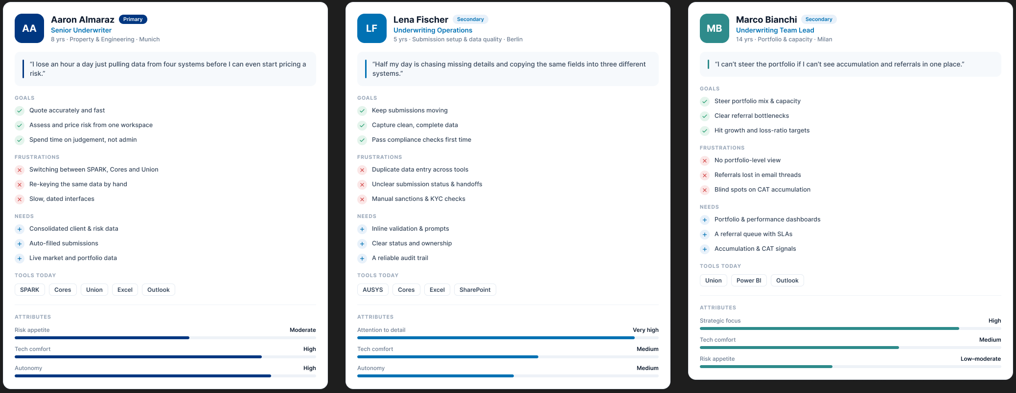
Aaron · primary
Wants to quote accurately and fast, from one workspace, spending time on judgement not admin.
Lena · operations
Wants submissions to keep moving, with clean data and compliance passed first time.
Marco · team lead
Wants to steer portfolio and capacity, and see catastrophe accumulation in one place.
Journey map
Where the journey actually hurt
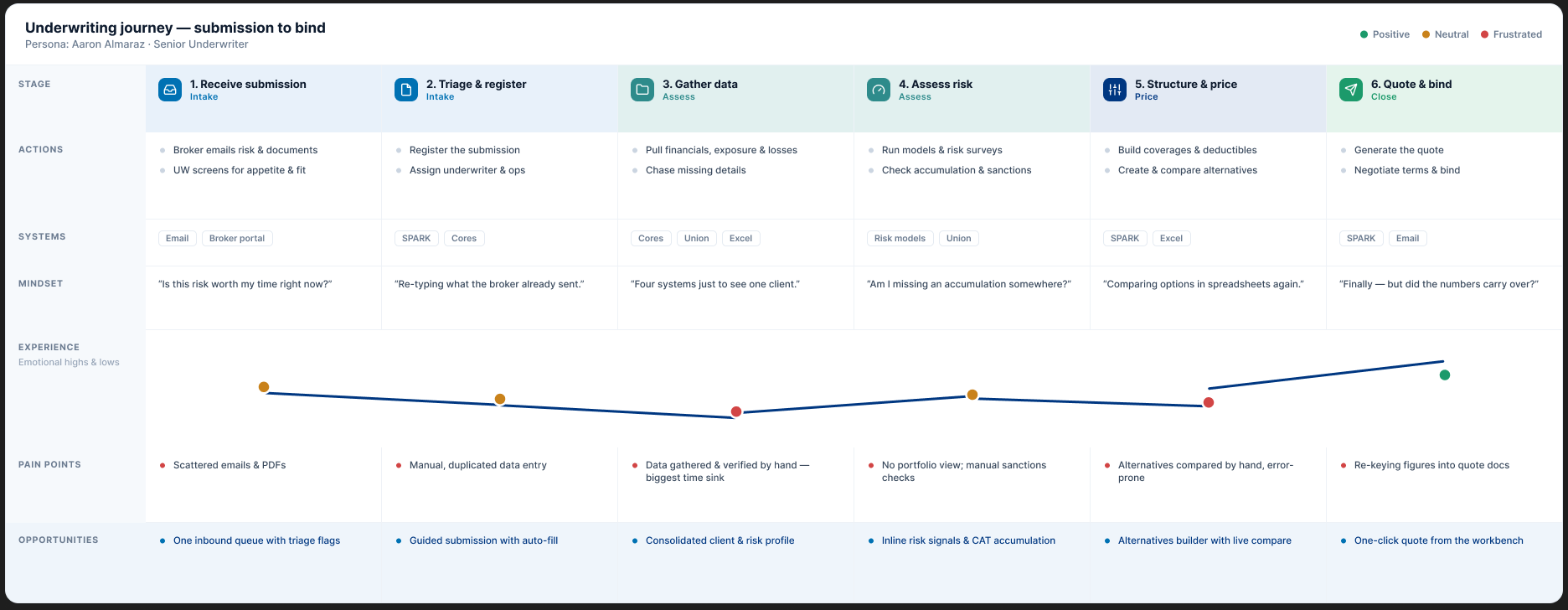
I mapped the underwriter's journey end to end, from receiving a submission to binding the risk. The emotion curve made the priorities obvious: the deepest dip sits at gather data, exactly where the tool-switching and manual work concentrated. Every pain point got a matching design opportunity.
The key insight
The underwriter's job is judgement.
Everything the tool makes them do before that, the switching, the copying, the chasing, is overhead. Put the whole submission in one place and the overhead falls away.
One spine, one submission
The submission is the backbone. Client, coverage, programme and pricing all hang off it, so nothing is entered twice.
Signals where you work
Risk, accumulation and compliance signals surface inline, next to the decision, not in a separate report.
Depth on demand
A daily glance and a complex programme placement share one system, each reaching only the depth it needs.
Legible by default
Status is never colour alone. Icon, label and colour together, so a glance is unambiguous.
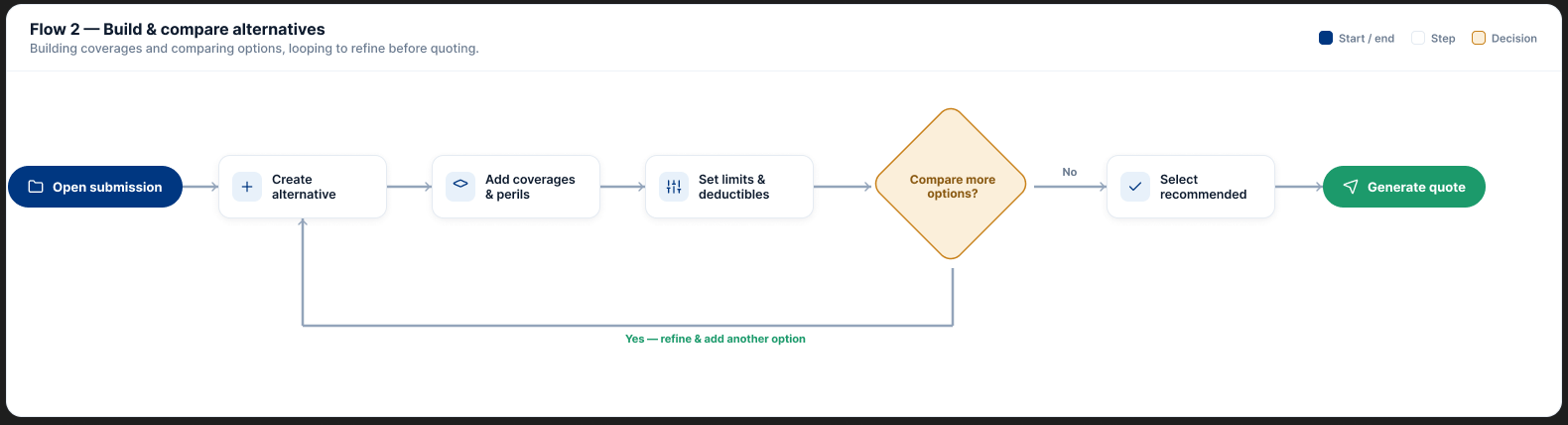
User flows
Two core flows, mapped before design
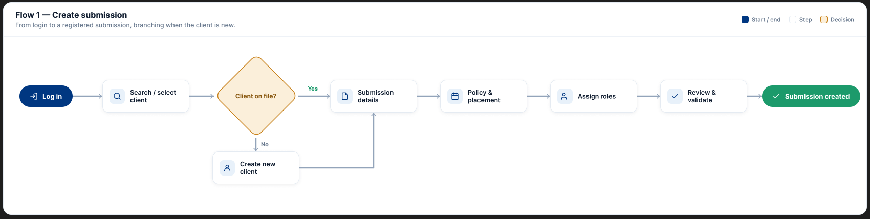
Before touching pixels, I mapped the two journeys we shipped first. Flows made the branches and loops explicit, so we could test the logic with product owners before it cost anything.
Wireframes
Testing the structure before the surface.
We validated low-fidelity skeletons with underwriters and product owners before committing to visual design. Working in grey kept the conversation on structure and priority, not colour, and let us move fast between rounds.
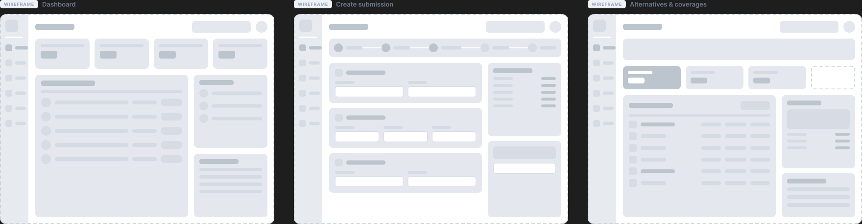
Structure first
Hierarchy and grouping settled in grey, cheap to change.
Tested with users
Underwriters and POs reacted to layout before we invested in polish.
Clean handoff
Validated skeletons flowed straight into visual design.
Process
Understand, define, design, on a loop.
We worked in a tight loop, repeated each sprint: understand the problem space, define the flows, then design the visuals, with hygiene checks along the way. The design team stayed two weeks ahead of the build.
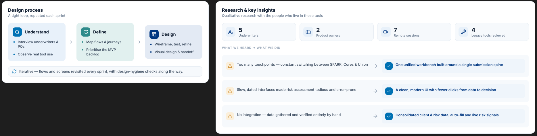
Phase 1: MVP
Broken into three program increments of twelve weekly sprints each. MVP features became user stories the teams pulled from every sprint.
Two-week head start
Design ran ahead of development, so validated flows and screens were ready when the build needed them.
Feb 2022 to Dec 2023
A steady cadence from first research through the mid corporate flows and into the large corporate and catastrophe work.
Design system
A calm, legible enterprise system.
The interface runs on a small, consistent kit: an Allianz navy anchor, one accent blue, a quiet neutral canvas, and a clear red, amber, green scale for status. Generous spacing and soft cards keep a dense, data-heavy tool feeling calm. Every status pairs a colour with an icon and a worded label, so it reads correctly at a glance and for anyone who sees colour differently.
Building blocks were a tight set reused everywhere: KPI tiles, data tables, status badges, form fields, steppers, segmented controls, progress bars and side rails. Inter throughout, a tight scale from large display numbers on KPIs down to dense table text tuned for scanning.
The solution · Dashboard
A place to start the day.
The old tools had no home. The workbench opens on a dashboard that answers the underwriter's first questions before they touch a control: what is on my plate, what is due, and what needs my attention right now.
KPIs up top
Open submissions, bound premium, quote turnaround and hit ratio, with trend at a glance.
My submissions
The working queue: client, line of business, sum insured, due date and a legible status.
Needs attention
Accumulation, sanctions and reinsurance flags surfaced before they become blockers.
The solution · Create submission
Registering a risk, without the re-keying.
The first flow we built. An underwriter registers a new submission for a client. What was a long, flat form across systems becomes a guided, sectioned flow with a clear stepper and a live summary. This is the screen that most directly answers the research: the manual gathering that used to sit here is designed out.
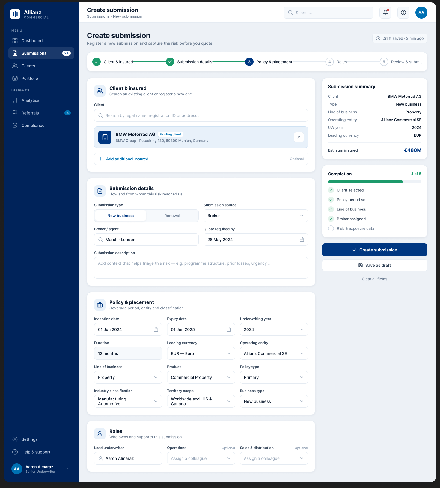
Guided steps
Client, policy and placement, roles, review, each a calm section rather than one wall of fields.
Auto-fill
A known client fills its own details, so nothing is typed twice.
Live summary
A running summary and completion checklist keep the underwriter oriented.
Legible validation
The path to a valid submission is always visible.
The solution · Alternatives & coverages
Building and comparing the options.
The second flow lets underwriters create and compare alternatives, then manage coverages, extensions and exclusions. Options that used to be compared in spreadsheets now sit side by side in the workbench, with the numbers carried through.
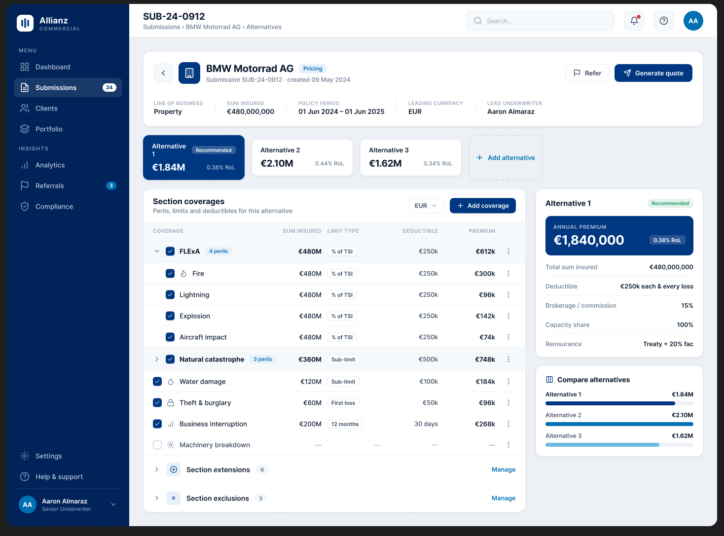
Compare alternatives
Each alternative shows its premium and rate on line, so the recommended option is obvious.
Coverage builder
Perils grouped and expandable, with sum insured, limit type, deductible and premium in one table.
Live summary
A running total and a compare view keep pricing decisions grounded.
The complex end · Program structure
Layered programmes, made visible.
Large corporate risks are placed in layers, each with its own limit, attachment point and share. The workbench turns that abstraction into a tower you can read: how the programme stacks up, and how much of each layer Allianz keeps versus cedes to reinsurance.
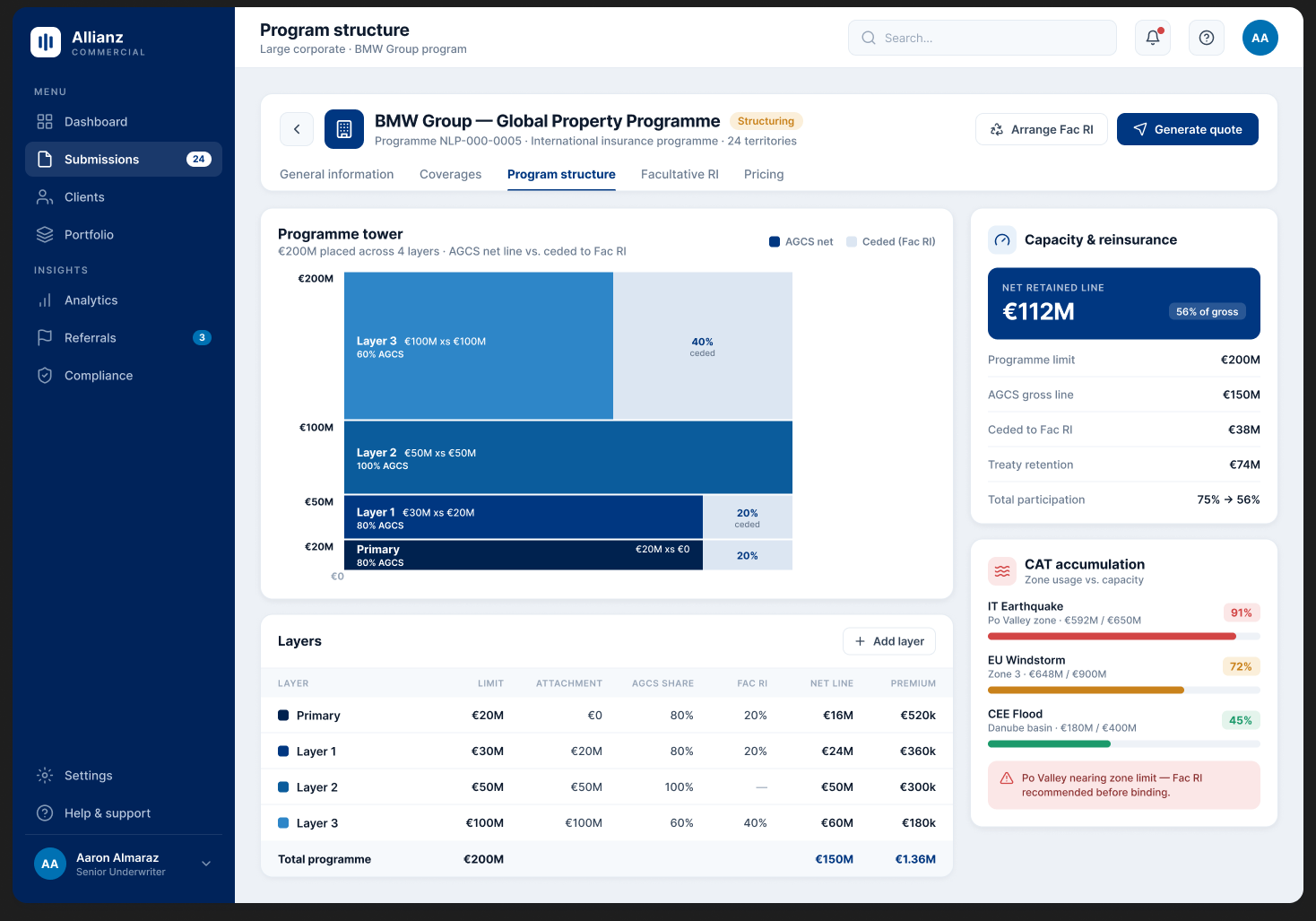
The tower
Primary and excess layers stacked to the programme limit, split into net line and ceded share.
Capacity at a glance
Net retained line, gross line and participation before and after reinsurance.
Accumulation inline
Catastrophe zone usage sits right beside the structure, flagging where to cede.
The complex end · Facultative reinsurance
Ceding risk, in one clear view.
When a layer carries too much catastrophe exposure, the underwriter cedes part of it to reinsurers. That used to mean another system. Here it is a clear panel: define a reinsurance segment, choose the perils ceded, and place shares with a panel of reinsurers.
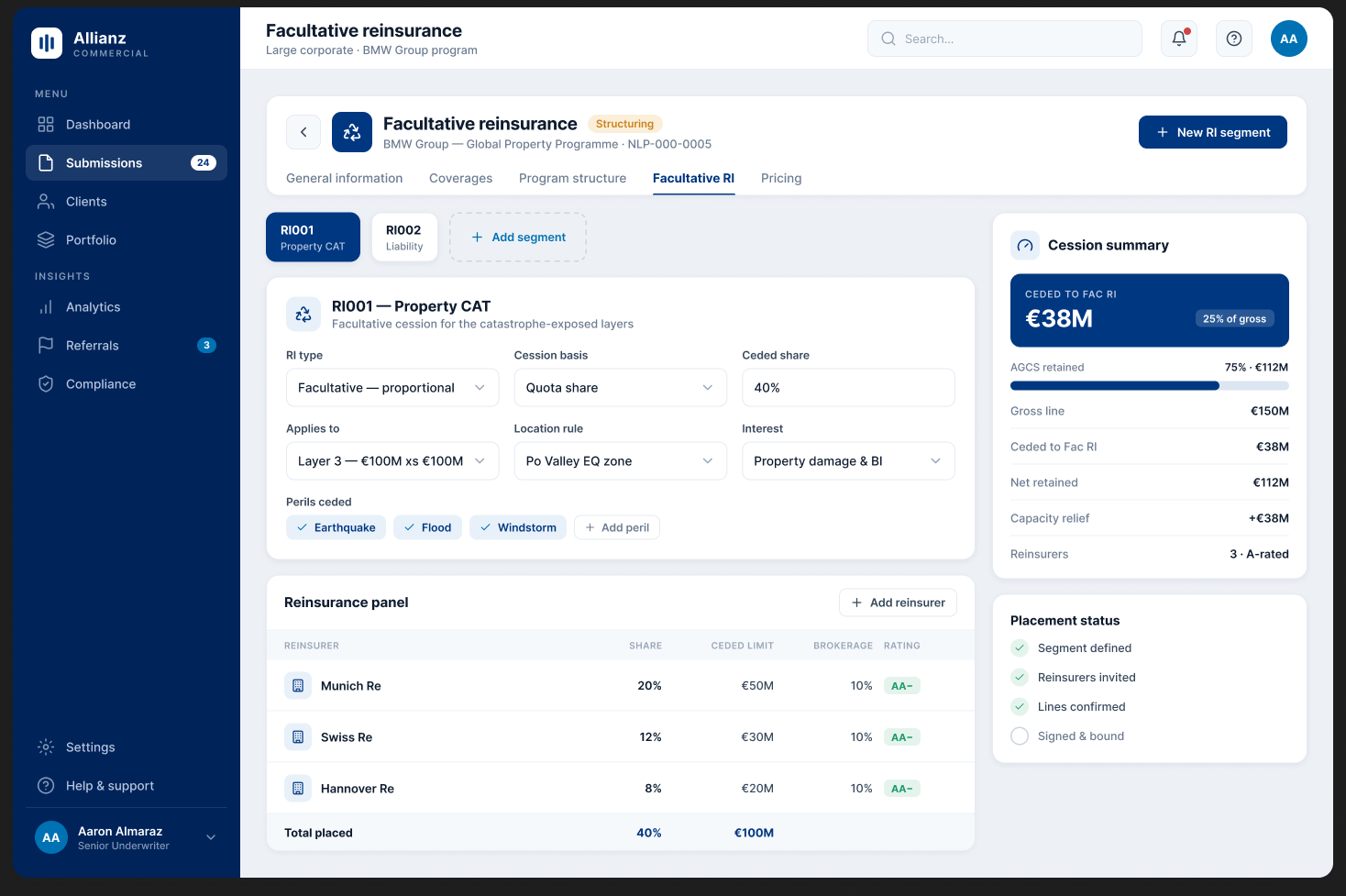
RI segments
Group what is ceded, by peril and location rule.
Reinsurance panel
Reinsurers, shares, ceded limits and ratings in one table.
Cession summary
Net retained versus ceded, and the capacity relief it buys, kept in view.
Placement status
A simple checklist from defined to signed and bound.
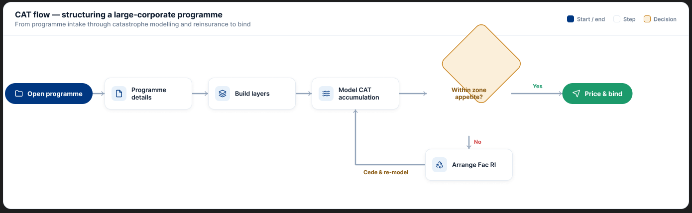
The complex end · Catastrophe accumulation
Keeping catastrophe inside appetite.
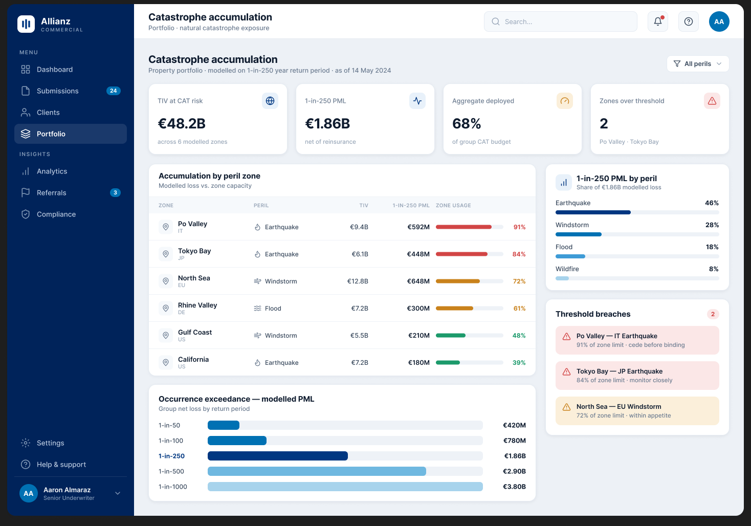
At the portfolio level, a catastrophe view shows how much of each peril zone is used against its capacity, so a team lead can see where the book is getting crowded before binding the next large risk.
Impact
One workspace instead of many.
We delivered the MVP of the unified workbench, bringing a patchwork of regional tools into one workspace designed to cut the tool-switching and manual data gathering that slowed quotes.
What shipped
The submission and alternatives flows, plus the large corporate program structure, facultative reinsurance and catastrophe views.
Handover
After the design stage, an in-house design team took the product forward, so post-launch performance metrics sit with them.
The win here is structural, not a headline number. We replaced a way of working, four tools and a stack of spreadsheets, with one workbench that matches how underwriting actually flows.
The honest read.Reflection
What I would carry forward.
Designing to a single idea
One submission spine gave every screen a reason to exist and a place to sit.
Watching real work
Observation, not just interviews, is what surfaced the manual gathering that mattered most.
Close the measurement loop
I would fight harder to instrument time-to-quote so the impact is provable, not just felt.
Design for the handover
Knowing an in-house team would inherit it, more of the system deserved documenting up front.
The best thing we did was refuse to tidy up four tools. We asked instead what one workbench should be, and let the answer reorganise the work.
Next project
Document Manager · Marsh