05 · Marsh · Doc & Email Library
Bringing the document library to where brokers already work.
A redesign of Marsh's document and email system that stops treating filing as a separate errand. One library, reachable from every tool a broker already uses, with search that finds things and storage that takes seconds.
At a glance
The one-minute version
Marsh brokers live inside documents: policies, endorsements, invoices, binders, correspondence. The old way of storing and finding them, a separate system called MDocs, sat off to the side of their real work. Every file meant leaving the task, logging in somewhere else, and digging through folders. I redesigned it into one Doc & Email Library that lives inside the tools brokers already use, so filing and finding stop being a detour.
The problem
Documents lived in a separate system. To file or find one, a broker had to leave their workflow, log into MDocs, and navigate to the right client and folder. Slow, easy to get wrong, and impossible to do in bulk.
The move
Embed a single library across every broker touchpoint, organised the way work is structured: Account, Placement, Policy, and Billing. Bring the documents to the work.
My role
UX Designer. I owned the research framing, information architecture, the task flows, and the interaction and visual design, from low-fidelity wireframes through the validated hi-fi screens.
The approach
A user-centred method structured as 3E: Explain, Execute, Examine. Understand the work first, design against it, then validate with the people who do it.
Nobody should have to leave their work to file a document. The library should already be in the room.
The idea the library was built around.Context
What the library is, and who leans on it.
Marsh is one of the world's largest insurance brokers and risk advisers. A broker's day runs on documents: quotes and proposals, binders, endorsements, invoices, premium schedules, and the email trails that go with every placement. For a single client, that can be hundreds of files across many policy years.
MDocs was Marsh's document store. It worked, but it sat apart from the systems brokers actually place and service business in: MART, Placement Manager, and the Colleague Desktop. Filing meant switching context; finding meant remembering where something had been put.
The brief was to design a Doc & Email Library that could be reached from inside those systems, so a broker never has to break their flow to store, retrieve, or share a file.
Find
Locate a specific file for a specific client, fast, often mid-conversation.
Add
Store an incoming document or email against the right client and policy.
Track
Know whether an upload succeeded and keep a file current as it changes.
The problem
Filing a document was a trip out of the workday.
MDocs did its job as a store, but the path to it was the problem. Every interaction pulled the broker away from the task in hand and asked them to do the librarian's work by hand.
What made it slow
A separate destination. Opening MDocs and uploading documents was a step
apart from the work that produced them.
Log in, then hunt. Getting to the correct client and folder was a
repetitive, time-taking process every single time.
Hard to keep current. Tracking and updating files as they changed was
difficult, so versions drifted.
A poor filing system. For a broker juggling many clients and policy years,
the folder structure did not match how the work is actually organised.
No bulk. Files could not be downloaded in bulk, so pulling a set of documents
meant repeating the same manual steps.
The tell came straight from the people who used it: "I want to decrease my time and effort in arranging documents." When the goal a user states is simply to spend less time fighting the tool, the tool is the work, not the help.
Goals & success criteria
What a good version had to do.
The crux of the solution came down to three promises to the broker, plus the one structural bet that makes all three possible: put the library inside the work.
1Efficient search
Finding a document should be dynamic and instant, filter and search on any column, not a folder-by-folder hunt.
2Time efficiency
Cut the steps in the tasks people repeat most. Fewer clicks, no separate log-in, and bulk actions where they matter.
3Simplification
Make onboarding and storage simple. Automatic naming and a clear structure instead of a folder tree to memorise.
4One embedded surface
Reach the same library from every system a broker uses, and keep it consistent everywhere. One experience, not five.
| Signal we designed for | Old behaviour | Target behaviour |
|---|---|---|
| Finding a file | Log in, then navigate folders | Search or filter any column, in place |
| Filing a file | Leave the task, upload separately | Drag, drop, and store from the current screen |
| Naming | Typed by hand, every time | Suggested automatically from context |
| Working in bulk | Not possible | Export and act on many at once |
| Knowing it worked | Unclear upload status | Clear success, in-progress, and failed states |
My role & team
What I owned.
I led the UX design for the Doc & Email Library: framing the problem with the client, structuring the information architecture, mapping the task flows, and designing the interactions and visuals from first sketch to the validated hi-fi screens.
I owned the discovery and a UX expert audit of the existing MDocs experience, the research synthesis, personas, user and task flows, the information architecture, low-to-high fidelity wireframes, and the visual design through to usability testing. I worked alongside Marsh business and product stakeholders for direction and sign-off, broker subject-matter experts for context and validation, and engineering for feasibility and build.
Direction
Marsh stakeholders set the business goals, requirements, and sign-off.
Design (me)
Research, IA, flows, interaction, and the visual system.
Build
Engineering implemented the library across the broker systems.
Research & discovery
Learning how brokers actually handle documents.
Discovery ran on three tracks: understand the people, analyse the problem, and develop the concept. I collected data on how documents are used and did a behavioural assessment of daily tasks, ran a UX expert audit of MDocs alongside competitive analysis and benchmarking, and worked up early directions through brainstorming and group discussions with stakeholders.
What I heard, again and again:
"I spend too long just getting to the right client and file." · "I want to upload several documents at once." · "After I upload, I am not sure it actually went through." · "Keeping every file current across policy years is hard."
Documents follow the work
They belong to an account, a placement, a policy, or a bill, not to an arbitrary folder.
Search beats structure
Brokers look things up by what they know, a name, a date, a carrier, not by remembering a path.
Filing must be effortless
If storing a document takes real effort, it will be done late, or not at all.
A note on honesty: the personas and journey that follow are design personas, synthesised from the user research, the expert audit, and stakeholder conversations. They are decision-making tools, framed as such, not a claim of large-sample quantitative study.
Personas
Two brokers, one shared friction
Every decision was checked against these two. They work in different markets and at different stages of a career, but they meet at the same wall: too much time spent arranging documents instead of advising clients.

In their words
"I want to decrease my time and effort in arranging documents."
Objectives
Upload multiple documents at once, know the status once uploaded, and update a file whenever it changes.
Concerns
Effort managing documents that already exist, and the time it takes to log in and find one specific client and file.
Win (new)
Files land in a few seconds, and every upload shows a clear status.

In their words
"I want to give my clients the best advice when they choose their insurance products."
Objectives
Move between different clients easily, upload files to a dedicated place, and keep documents current as a placement evolves.
Concerns
Keeping track of uploaded and updated files is hard and time-taking, and the filing system does not fit how a broker works.
Win (new)
Switches client and finds any document by search, without the folder hunt.
The key insight
The library comes to the work.
Instead of sending brokers out to a separate store, put one document library inside every system they already use, organised the way their work is organised. Filing and finding stop being errands and become part of the task in front of them.
Principle 1 · Embed, don't redirect
Reach the same library from Colleague Desktop, Placement Manager, Marketing, and Billing. No separate destination, no second log-in.
Principle 2 · Find in seconds
Search and filter on any column. Brokers look up what they know, so the interface indexes by name, date, carrier, and status.
Principle 3 · File without friction
Drag and drop, including straight from Outlook, with names suggested automatically. Storing a document takes seconds.
Principle 4 · One surface, everywhere
The same tabs, list, and controls in every context. Learn it once and it is the same wherever a broker meets it.
Information architecture
From a separate store to one embedded library
Five broker systems, Colleague Desktop, MART Placement Manager, Marketing Information, Billing Request, and the submission headers, now open the same Document Interface. Inside, the library is split into the four ways broking work is organised, with everything a broker does in one place.
Account
Documents that belong to the client account, with their own data list and filters.
Placement
Everything tied to a placement, filterable by date, carrier, and coverage.
Policy
Policy documents across years, searchable on any column.
Billing
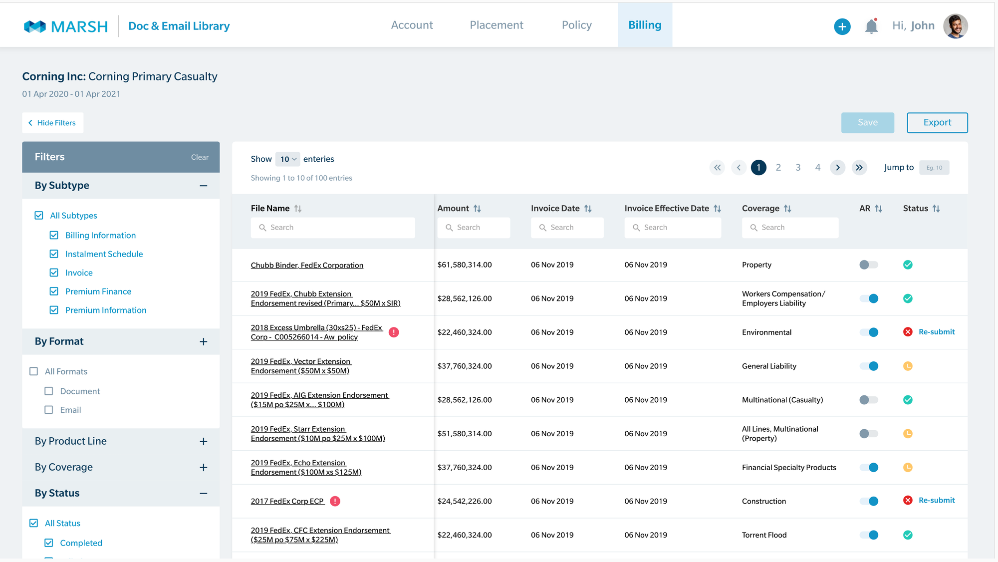
Invoices and premium documents, with amounts and dates in the list.
Add document
Select or drag a file, enter details, and upload, right from the list.
Notification
Failed, in-process, and success states for every upload.
Profile
Account and preferences, consistent across every entry point.
The solution · The library
One list, four tabs, everything in reach.
The heart of the product is a single, dense document list. Four tabs, Account, Placement, Policy, and Billing, mirror how broking work is structured, so a broker lands exactly where the document belongs. Actions that used to be separate trips now sit on the same screen.
Tabs match the work
Account, Placement, Policy, Billing. The document sits with the part of the deal it belongs to.
Rich, readable rows
A high-information table with generous rows and clear column heads, sortable and scannable.
Actions in place
Add, save, and export live on the page. No separate log-in, no bulk that cannot be done.
The solution · Find
Search that meets the broker where they already look.
The single biggest time sink was gone: no more logging in and walking a folder tree. A collapsible filter rail narrows by subtype, format, product line, coverage, and status, while a search field under every column handles the rest. Look things up the way brokers think, by name, date, carrier, or status.
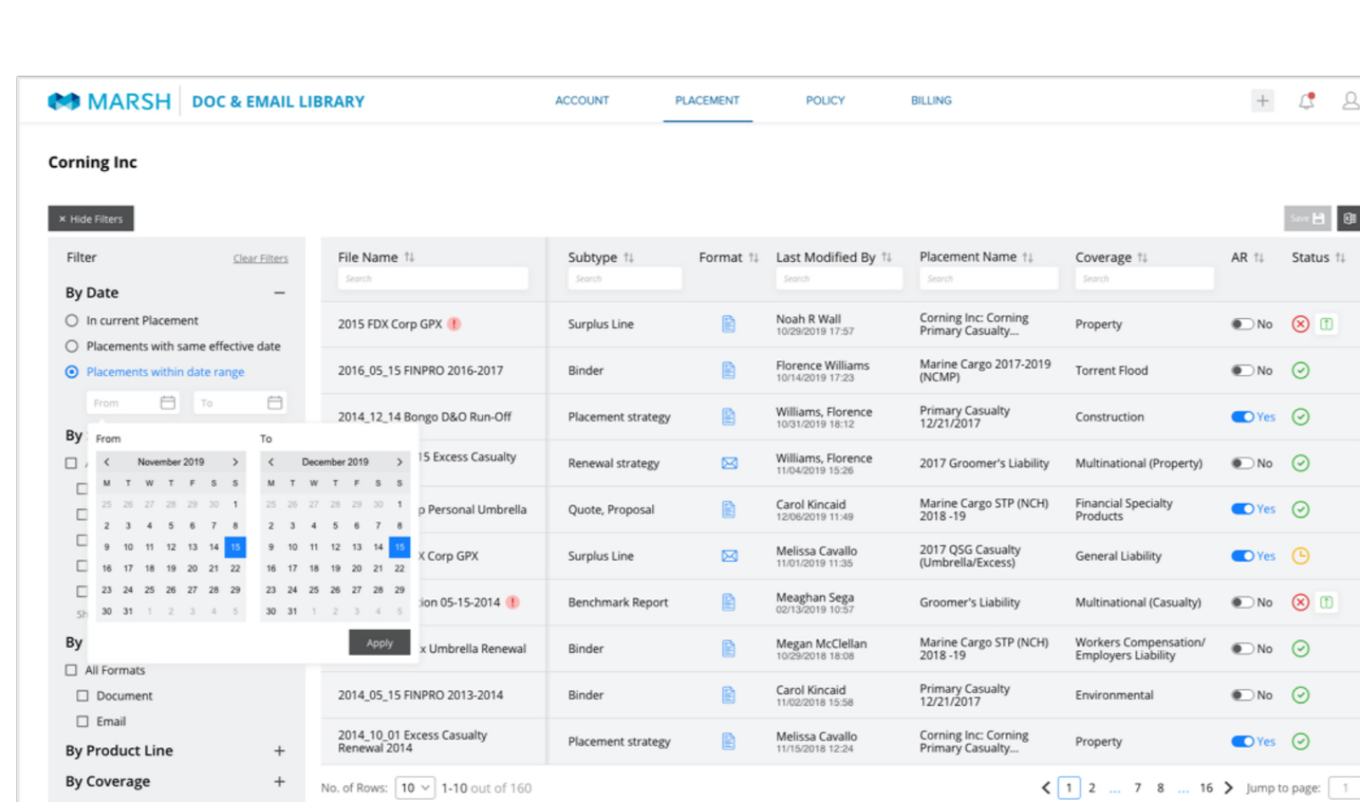
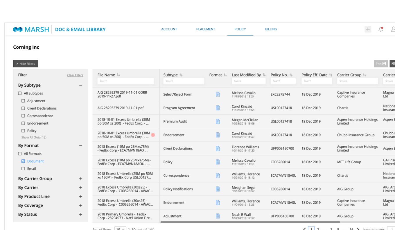
Efficient search, delivered. Dynamic searching and filtering replace the folder hunt. The document a broker needs is a keystroke away, not a navigation task.
The solution · Add
Filing a document, in a few seconds.
Adding a document used to mean a separate upload chore. Now it is a short, guided flow that starts from the list itself: drag a file in, let the system suggest its name, confirm a few details, and it lands in the right place. Documents and emails can come straight from Outlook, a shared drive, or the desktop.
Drag and drop
From Outlook, a shared or local drive, or the desktop, straight into the list.
Automatic naming
Names are suggested from context, so files land tidy and findable without manual typing.
Right place, first time
The document lands against the correct account, placement, policy, or bill.
The solution · Track
Always knowing whether it actually worked.
One of the loudest complaints was uncertainty after an upload. A notification centre now groups every upload into three clear states, so a broker can see what went through, what is still processing, and what needs another try, with a one-tap re-submit on anything that failed.
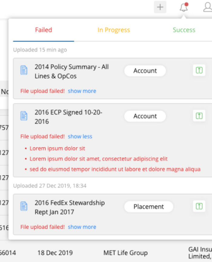
Failed
See exactly why the upload failed, then re-submit without starting over.
In progress
Watch documents still processing, so nothing is assumed done before it is.
Success
Confirm what landed, then clear or refresh the list. No more guessing.
Design system
A calm, on-brand Marsh interface.
The visual system leans on Marsh's blues and a restrained, data-dense layout. The point of a document tool is the documents, so the interface stays quiet and lets the list do the work.
Density with air. A high-information table, but generous rows and clear
column heads keep it scannable.
Search on every column. A search field sits under each header, so filtering
is where the eye already is.
Status is icon plus colour. Success, in-progress, and failed each carry a
shape, not colour alone.
Before & after
Same documents, a very different amount of effort
| Dimension | Before (MDocs) | After (Doc & Email Library) |
|---|---|---|
| Where it lives | A separate system, off to the side | Embedded in every broker touchpoint |
| Finding a file | Log in, then navigate folders | Search and filter any column, in place |
| Filing a file | Leave the task, upload by hand | Drag, drop, auto-name, done |
| Bulk actions | Not possible | Export and act on many at once |
| Upload status | Unclear | Failed, in-progress, success, with re-submit |
Process
3E: Explain, Execute, Examine.
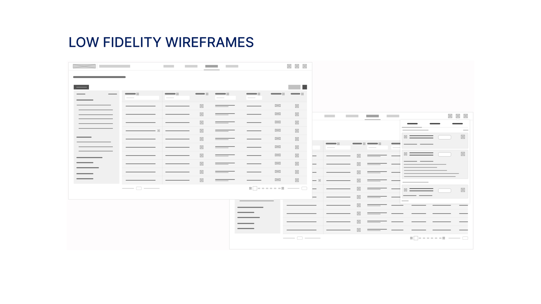
The engagement ran on a three-step user-centred method: understand the work deeply, design a viable solution against it, then prove the solution with the people who do the work. Structure was settled in low fidelity first, then taken to build-ready hi-fi, testing and iterating along the way.
Explain
A UX workshop to understand the business processes, user workflows, and tasks, plus interviews, scenarios, and personas.
Execute
Sketches, low and high-fidelity wireframes, a visual system, and a specification for a pixel-perfect build.
Examine
Usability testing against clear metrics, a findings report, and multi-level iteration to perfect the experience.
Validation & reception
Proving it with the people who use it.
The final E, Examine, was not a formality. The design went through usability testing and multiple rounds of iteration against clear metrics, pressure-testing every scenario, bottleneck, and breakage before it was signed off.
What validation confirmed
Brokers reached documents without the old log-in-and-navigate detour, and drag-and-drop filing with suggested names removed the manual chore.
And
Clear upload states resolved the "did it work?" uncertainty, and one consistent surface across systems flattened the learning curve.
Outcomes
What the redesign set out to deliver.
The engagement was framed around three outcomes for Marsh and its brokers. Each maps directly to a decision in the design. With no live post-rollout figures to hand, the honest read is the intended value, plus the signals I would instrument.
Transformational impact
Efficiency and ease of use as the headline. Fewer steps in the tasks brokers repeat most, so time goes to clients, not filing.
A unified experience
One consistent library across every touchpoint, with seamless transitions between the systems a broker already uses.
Credibility
A reliable, user-friendly tool builds trust in the system, and in Marsh, as the place the work is done well.
| Question | Signal to watch after rollout |
|---|---|
| Do brokers find files faster? | Time and clicks to locate a document; use of search versus navigation |
| Is filing actually quicker? | Time to store a document; share of uploads via drag-and-drop |
| Did uncertainty drop? | Fewer "did my upload work?" support tickets; re-submit rates |
| Is it being adopted? | Active use across the embedded entry points versus the old store |
Reflection
What I would carry forward.
Meet the work where it is
The biggest win was structural, not visual. Embedding the library into the broker's existing tools did more for productivity than any single screen could.
Search over structure
People remember what a document is about, not where it was filed. Designing for lookup rather than folders is what made it feel fast.
Effortless beats featureful
Drag-and-drop and automatic naming mattered more than any advanced option. Remove the friction and the task takes care of itself.
Close the loop
Clear upload states were a small feature with an outsized effect on trust. Never leave a user wondering whether an action worked.
If I did it again
Instrument the live product against the signals above from day one. Push automatic naming further, learning conventions from how each team actually files. Test the embedded entry points with brokers in their real workflow, not just the library in isolation.
Next project
MCA Platform